As part of the Digital Grad Show, I’ve got to design an A2 poster which will encapsulate and represent my work. It will make sense for the poster to be specifically about the final animation and I think it’d be neat to design the poster as a movie poster.
I like graphic design but don’t consider myself an expert in the field. My poster will likely be inspired by other movie posters so I will use this blog post to talk about some existing poster ideas I like and what kind of approach I’ll take to the poster.
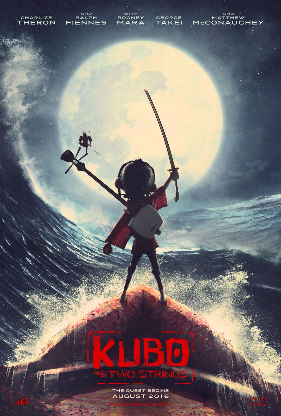
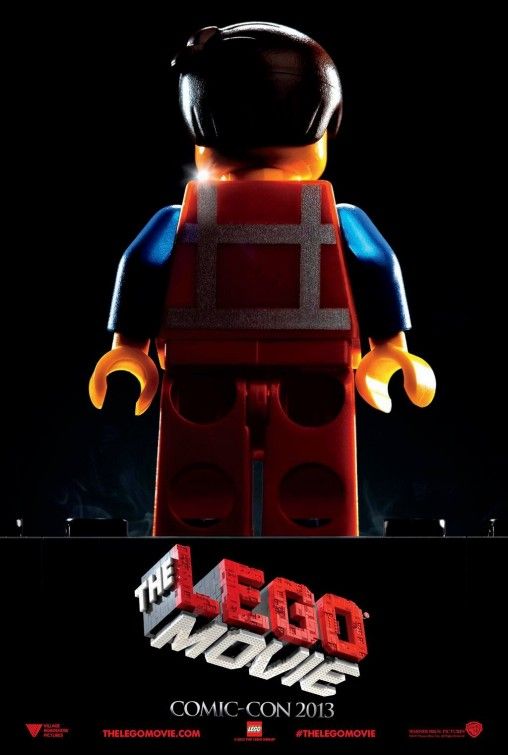
I started looking at posters for other stop motion films. I noticed that many were character based, often featuring the main character as the centre focal point of the poster. As with stop motion in general, they often show off the texture and detail of their craft.


As with all movie posters the movie’s title is also featured prominently and there is information about the cast and crew beneath. As I am the only person who starred in my own animation, I will replace this typical text with other information about my project. I can do this as from afar it will help to promote the movie-style of poster, while closeup offers a place to add additional information. I’m not sure what this information will be but it could be links to the project blog, the project’s aim or even a short description of the project as a whole.
I’ve realised I don’t have a title for my animation so I will need to consider a title in order to feature on the poster. I am famously known for being awful at naming things, from my own work to characters in a game, I spend too long trying to work out the right title. I will make efforts to talk with others and get suggestions. I don’t think the Honours project title of “Materials and Movement in Stop Motion Animation” is that exciting to put on a movie poster. Additionally, I’ll also need to consider the font and layout I use for the movie’s title/logo.
For the actual design I won’t know what I’m going for until I start prototyping ideas. I’m likely to include a frame from the animation or compose something from a different angle that still represents the animation. Using something I’ve captured from a photograph will capture all of the same elements that stop motion gets for free such as lighting and texture, and it makes the most sense to tell people what my movie will actually look like.


Stylistically I like posters that contrasts the character with something. I particularly like the posters for The Lego Movie and Kubo since the character is silhouetted by the light. Since my character can’t be contrasted with a grand set piece or another character, I may be able to use light to my advantage when photographing my set. My animation so far features a set which is the world that the character knows. I could play on this idea similar to what The Lego Movie poster does with the black unknown background.
Keeping the poster design relatively simple and confirming to traditional movie poster designs will help sell the idea that my poster is a movie poster and that my project’s main outcome is film based. Next step is to draw up thumbnails

[…] sketches show what I am thinking about making. I took inspiration from posters I’d already researched, in particular featuring the character with a non-detailed background. I considered using a frame […]