Although my portfolio and this blog have been submitted, my project is not yet complete. I shared some research and ideas for my showcase poster earlier and I’ve now completed the digital design which I will get printed out. While I would have liked to have shared the process of creating this poster, I have been focusing my writing towards dissertation amendments. The dissertation has also been completed which I may post to this blog at a later date.
During last Monday’s supervisor meeting I showed Lynn the poster sketches I created and we discussed potential animation title ideas. The three titles we both agreed were the strongest were “Set in Motion”, “Off the Set” and “Building Character”. While creating the design in Photoshop I stuck with “Set in Motion”.
My first digital poster drafts were these:
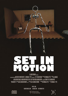
As discussed in the ideas post, I wanted to create movie poster style text at the bottom of the poster. I found a font which is similar to that used in movie posters. The font conveniently uses key binds to insert “Directed By”, “Produced By” etc. phrases in smaller sizes. I used these key bindings where possible however I also had to create my own smaller text for non-standard credits such as “Animated By” and “Filmed In”. I also used this opportunity to include a couple of humorous lines which people can see if they choose to read deeper into the text. The text was re-arranged a couple of times until I got the layout and content that I was happy with. I also plugged my website and Twitter handle.
From feedback to my ideas, I also incorporated the use of a cardboard texture as the background which added visual interest over a plain black background. I chose to use a frame from the animation which I altered to remove the background and enhance the armature so he stood out from the background more. I would have liked to have composed a new scene and taken a photo with a higher quality camera but due to the state of my animation studio after completing filming and the time I have left before the graduate show, I will just have to make do with a lower resolution photo from a captured frame.
The first drafts included a placeholder title which I acknowledged needed work on. Lynn preferred the first title layout and suggested that the text be tweaked so that letters would line up with each other. In the final draft I amended the E and the T in “SET” to better line up with each other. I also pushed the letters in “MOTION” closer together. The final design features the updated title logo and the spacing for the credits text were altered. I used the colorless logos as they were less jarring and also brightened up the background texture which was not always so visible when viewing outside Photoshop. I also cleared up the photograph included in the poster so that the blending of the photograph to the background didn’t look messy – again this was only showing up outside of Photoshop and I didn’t want to risk it showing up on the print.

I was a little worried to the actual printing of the poster, I’d seen that other people’s posters were printing darker than their designs when using Abertay’s Copyshop. While the price was the cheapest at the Copyshop I wasn’t entirely sure if the paper quality was as good as it could be. I wanted to have a movie poster quality, similar to what you might get from a movie poster bought from a shop. I found little information on what paper is used for this purpose and found that various print shops don’t make it entirely clear on what all the paper qualities are like. I visited various print shops in Dundee yesterday which was unfortunately a bank holiday so PDQ Print Services and Urban Print were shut. Mail Boxes Etc was open however only printed up to A3. I returned to PDQ today but they were unable to give me precise information on print quality or the darkening of the design. Their price was also higher than the Copyshop and I had not encountered anyone who had used them so couldn’t make a guess to what it would turn out like. So I ended up brightening my design up to send to Abertay Copyshop which I will be able to retrieve tomorrow.
I’ve found the exposition process, particularly the printing aspect, to be more stressful than it should be. The course handbook gives very little information in to the process of designing a poster and setting it up for print, e.g. colour mode, where to print, pricing, print quality, etc. While I have discovered a lot, to add on the PC interface content (thumbnails, images, videos preparation) immediately after completing hand-ins on the project leaves very little time to research this process.
I’ve also began to prepare other parts of the exposition including content that will be presented on the PC interface. This includes an animation showreel of my work which I will probably also include some of my work from 3rd year in addition to side projects. I will convert my final animation to the FLV format which works with the interface and also find music to add to the timelapse video I created for portfolio submission.