As part of the digital graduate show and general professional practice I am in need of a new business card. My previous business cards have been nothing special but I’ve never needed them for actual business purposes, they were mostly a simple way to give someone the link to my YouTube channel.
For reference this is the business card design I created in 1st year Dynamic Communication. In my first year of university I was overwhelmed with new ways of thinking and new skills to learn. As such, the designs I created were nothing special. For this module I also created a logo which I still use today. The logo is still okay but I feel it may need a revision in the near future.

I never actually printed these designs out to use so the last business card I actually had in hand was designed back in Secondary School and was pretty basic. Below is a scan of it since there was never a digital file it existed in.

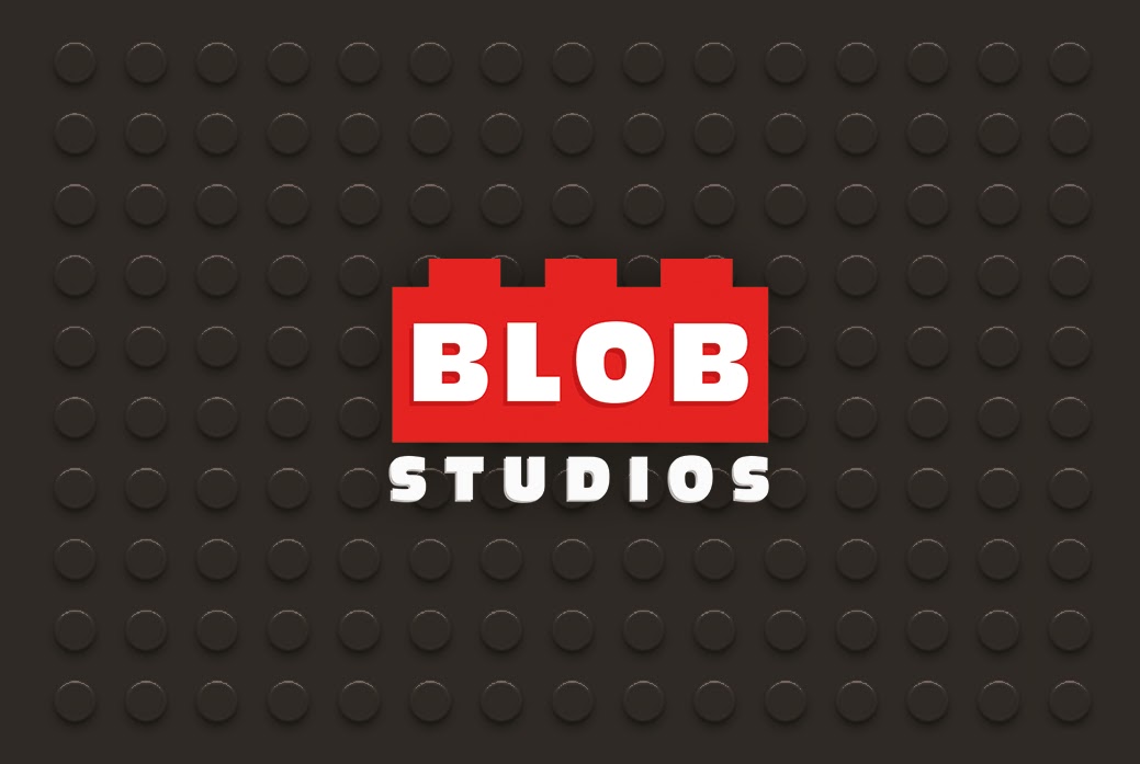
Although for the Digital Graduate Show, I want my business card to represent me and the work I create on a whole, hence using my “blobstudios” branding quite heavily. Through thinking about my new website design, I want each thing to match well with the other. I primarily use a dark grey or black, reds and whites throughout my brand so I wanted to continue that here. I had an idea about using a Lego style stud grid as a background.
The most important information I have to include is my name, website and email. My YouTube link is also pretty important and I may also want to include my phone number and Twitter handle (which is one of the easiest ways to get in contact with me, its one of the few social networks other than YouTube which I actively post on). I also considered my LinkedIn page but that may overload the card with information. If anyone desperately wants my LinkedIn it’ll be linked on my website.

This is the first draft that I’ve created based on my doodles. I really like the colours used and I think a darker background is a nice change from the white backgrounds I’ve used before. My intention was to use the stud grid background on the back of the card and I wasn’t entirely sure what to have on the front. Having the background on both ties the two sides together. I initially had the background with greater contrast but it didn’t look too great when text was put in front.
The card designs here include a trim area so the design will be cropped on all sides when it is printed.
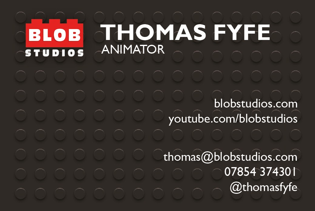
I think the back of the card is passable on its own however I will want to try out different layouts on the front of the card to make better use of the space. There are other things I will want to consider such as somehow including a few examples of my work or including icons beside the contact details.


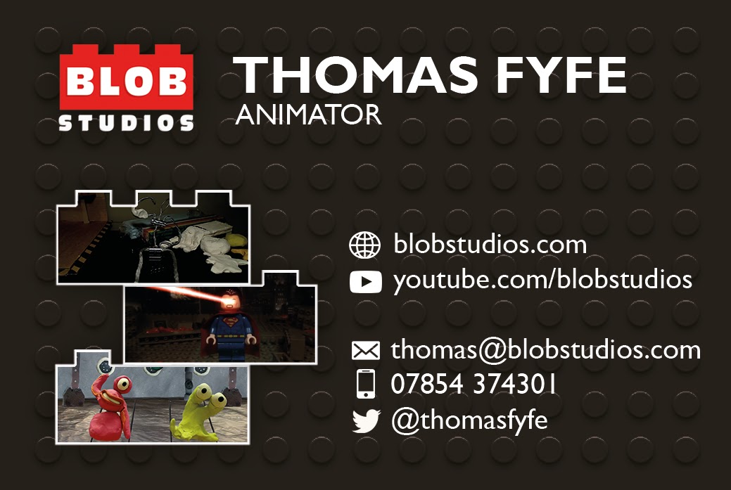
To fill in the blank spaces of the card I tried adding in examples of my work in a brick layout which resembles the logo. I also tried out adding different icons.
This is the same design except with a thicker border around the bricks, and I made it white just to see how that looks and also darkened the background to make the text more readable.
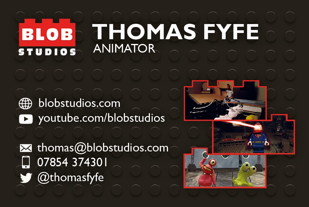
And here is another design where I’ve swapped the text and the bricks. I reverted back to the red bricks but included the thicker border. I’ve kept the darker background and have added in the faintest of drop shadows to the text to help with readability. I’ve also swapped out the top image for an easier to read image and colour corrected to make them easier to see.
I showed these designs to Lynn today and she seemed happy with the overall design. She brought attention to the images which may be too small to read easily and suggested printing out a paper prototype to get a sense of the scale. She also suggested maybe cutting down to two images or even one larger image with multiple variants showing off different projects.
I created a new design which features two bricks but one larger image. There are also multiple image variants. I reverted back to the white borders since it reads easier and tried to keep my horizontal and vertical lines aligned.
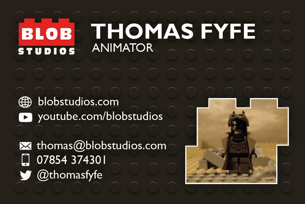
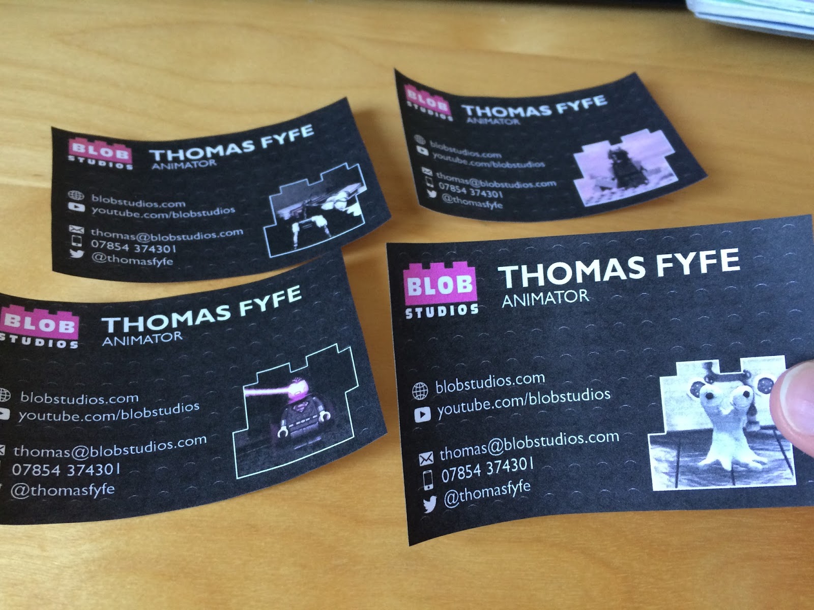
I also printed this design out and despite the printer running out of ink, I’m happy with how it looks. I will be sending these to print very soon.
[…] this out digitally and will work on this further during the week. Similar to the way I created the business cards, I will create some draft ideas that I can get feedback on. Hopefully I can get this sent away by […]